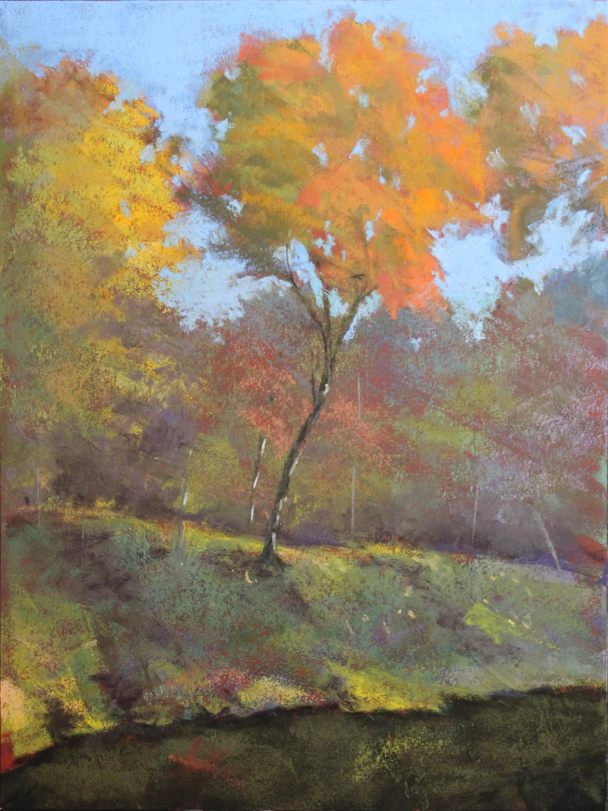
Demo- Autumn in Prairie Creek Park
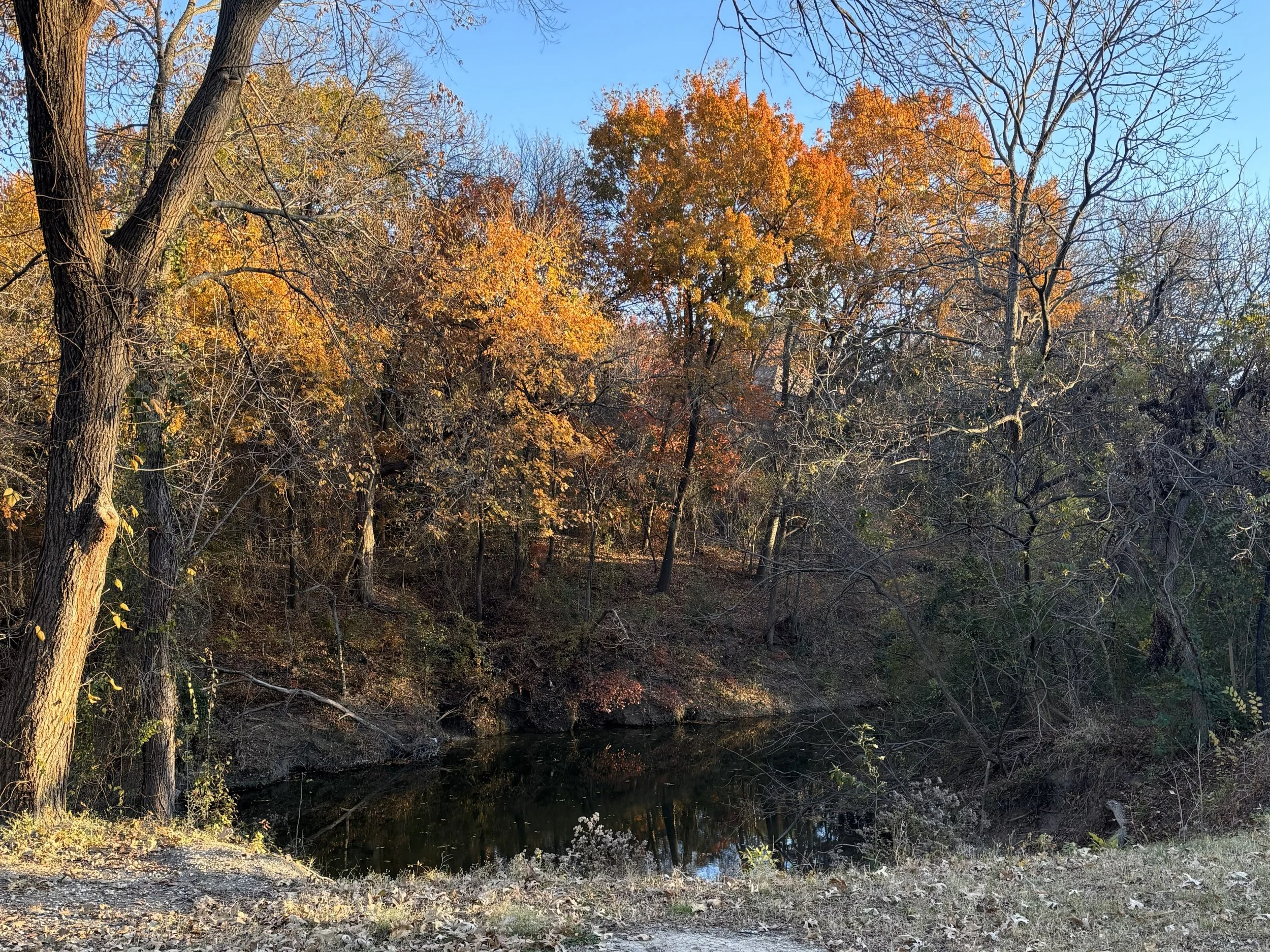
The Reference Photo
I took this reference picture in early December 2025 during our daily walk in Prairie Creek Park in Richardson, Texas. Autumn color in this part of the world lasts only a few weeks, and some years, it can be close to non-existent. I was eager to capture a colorful scene after the unrelenting green that we see here from April to November. The reference photo is already rather beautiful in its own right. Surprisingly, this can present a bit of a challenge, as the opportunities for improving on it are not plentiful, and there is pressure not to screw it up!
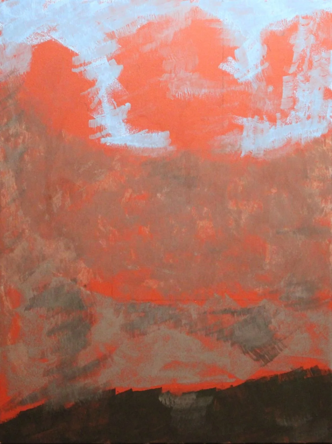
Stage 1
Stage 1: Drawing and Underpainting
After cropping the image to draw focus to the center trees, I started the painting by sketching the major shapes. While this doesn’t look like much just yet, I’ve located the creek bed, the sky, the central treetops, and the top of the bank. The surface I used here is archival fine grit sandpaper manufactured specifically for pastel. It comes (in this case) in the orange color shown. I laid down shapes in pastel and then sprayed alcohol over the surface to dissolve the pigment and set the image.
Stage 2: Establish Darks and Lights
Stage 2
Next, I established the darkest darks and the lightest lights in the image. I also solidified the shapes I laid down in Stage 1 and laid down a number of colors of the same value to represent the hues in the shaded part of the picture. It would be nearly impossible, or at least impossibly tedious, to reproduce the shadow colors exactly. Instead I laid down a representation of the impression the colors made.
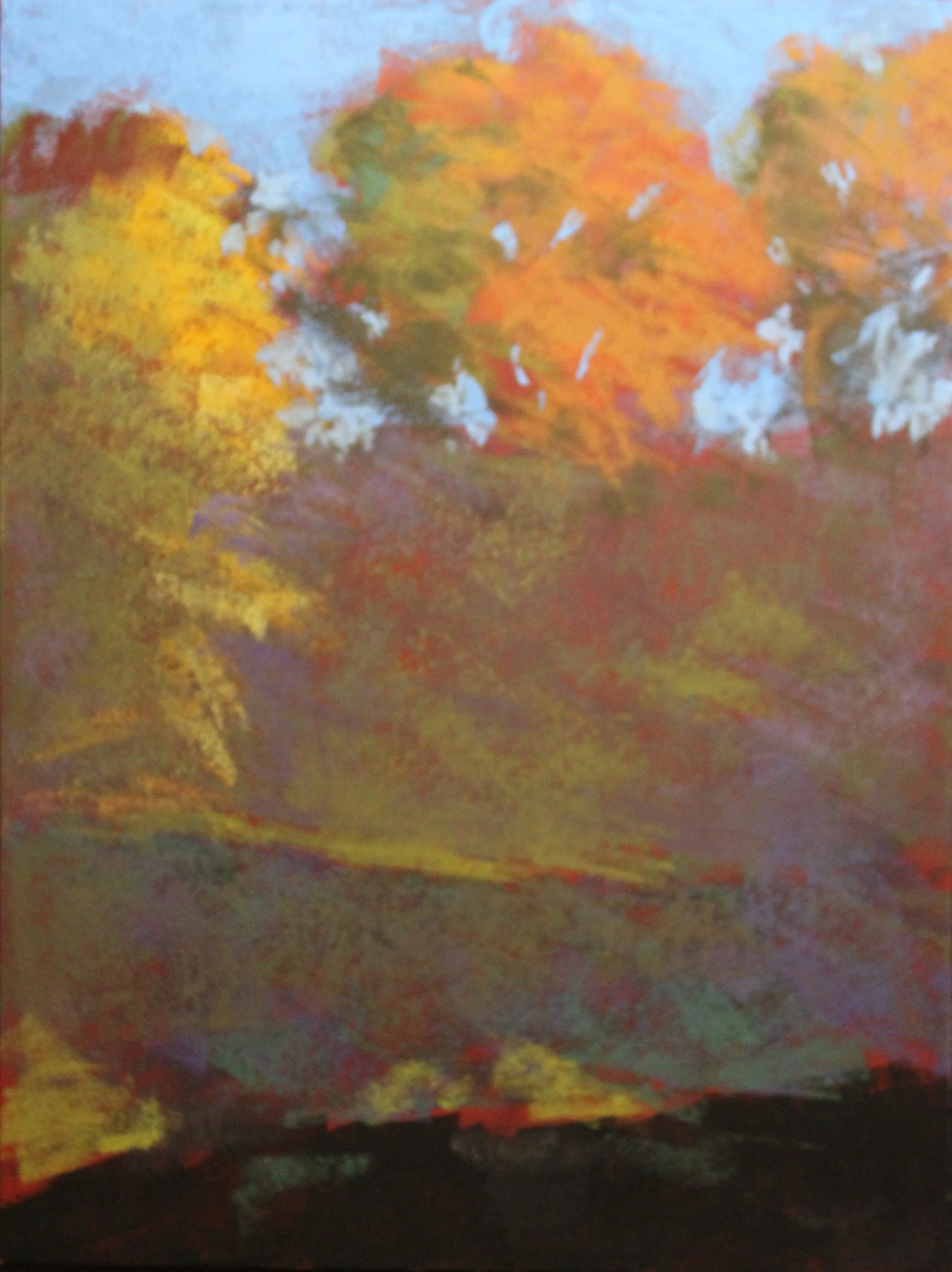
Stage 3: Refine the Bank, Add Tree Trunks
Stage 3
Here, I’ve further defined the highlights at the top and bottom of the bank and added the main tree trunk and some reflections in the water. Some dark just behind the bank starts to indicate the distance between the bank and the background trees.
Stage 4: Add Detail, Refine Colors
Stage 4
Up until now, the layers were essentially an underpainting, or a base to build the final colors upon. Most landscape paintings, but particularly pastels, need subtle color variation to look natural. Pastels also need to be built from dark to light as much as possible to keep the colors clean. Here I added greens in the bank and background and variety to the oranges in the featured trees to give them more dimensionality.
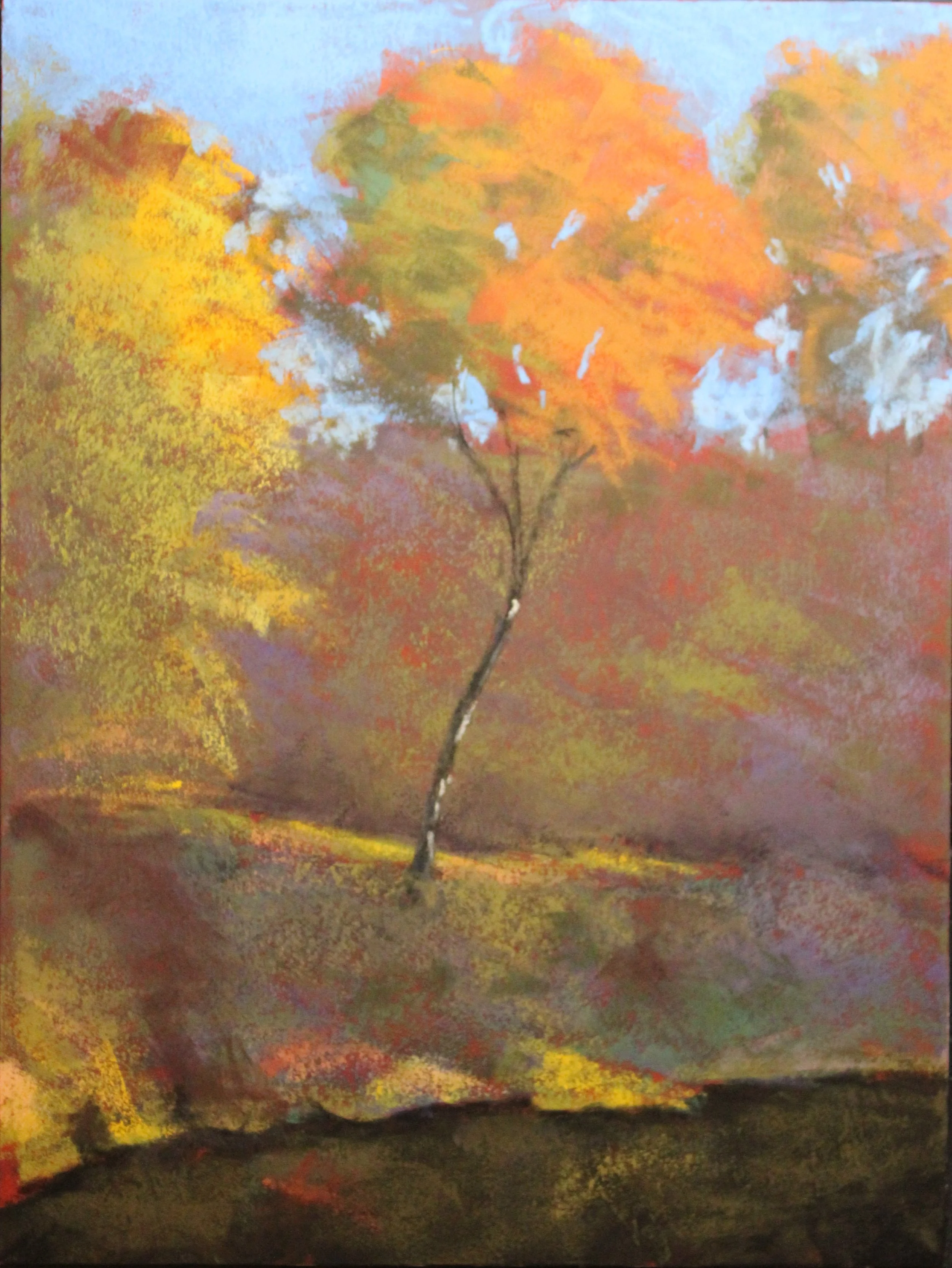
Stage 5: Final Details
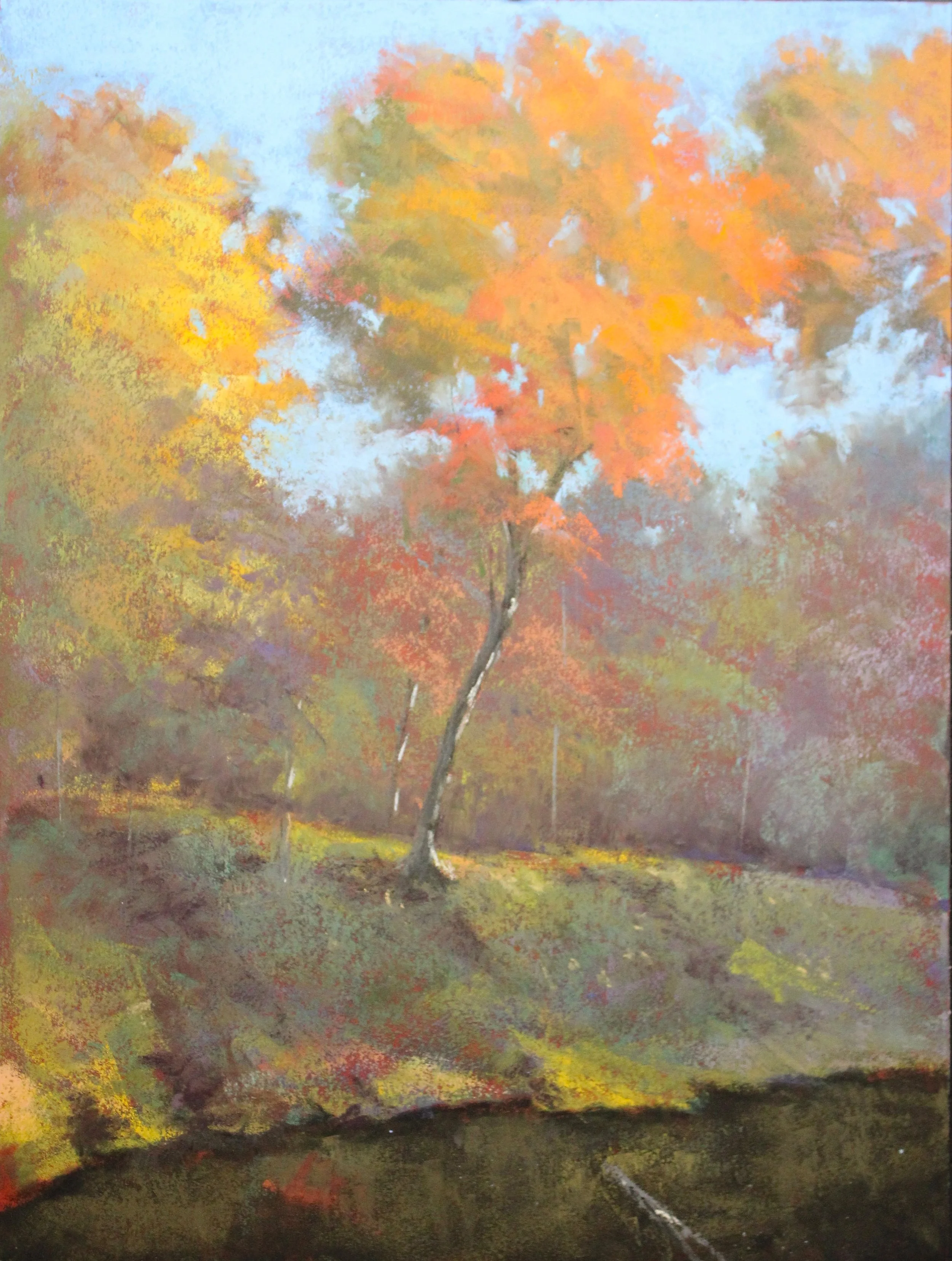
Stage 5
After putting the painting away for a few days, I made a few adjustments, mostly to make the colors on the bank make more sense and to smooth out some edges. Due to a unique circumstance, the “finished” painting was critiqued separately by award-winning pastel artists Jacob Aguiar and Lyn Asselta. Following their advice, I softened the edges of the background trees and added a reflection of the main tree trunk in the water to better tie the foreground and middle ground together.